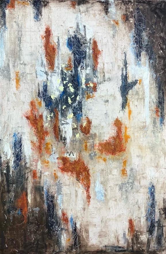
This was the first time I built & created one of my contemporary abstracts/ absrtact realism pieces in public. It’s usually a more solitary endeavor. It was an interesting challenge and exercise. I had several conversations about my process along the way, so here’s the inside story.
I had a very large canvas created, so big I couldn’t get it home in my vehicle. So I began, the first step was to put 8 layers of acrylic paint and inerference colors down, a while back. First coat was in a rusty iron oxide followed by several olive mixed with a gloss medium & varnish that’s multi directionally applied while water is splashed at it and tactfully removed just before it dries. to create a pattern, somewhat of a controlled chaos. Once this has been done in an organic drip & splatter way, the rhythm of the piece is there, determined, and just waiting for me too listern to its next direction. It was decided I’d do a live demo on building an abstract painting it over the last week or two of the event. The stage was set and I had been playing around with a thought & idea for several months.
I knew theme was to be figurative in nature. I began looking through photos of people, at first it was going to be 3, but soon after I landed on 5 and that it would be in an outdoor setting. Eventually I landed on the idea of a wilderness rock climbing, asysiphis thing of sorts, idea and created a compostion in my head. A lot of the preliminary work goes into the thinking out of the compostion then the approach that will best convey my idea. The thing about contemporary abstract realism is I know what my vision is, but never know for sure what others will see. Fortunatey, I love when they are engaged in a work and create their own stories & narratives surrounding it.
I started early the first day so I could concentrate and be sure I got the intitial form in place as desired, this was crucial for me. It was accomplished in prussian blue, indigo blue & white oil paint, with palette knife, scratching tool & tissues. The next session was to give more form, color and texture, again using a variety of palette knives & scraffitto. Scraffitto is my fasvorite part and its utilized from beginning to end of my process to reveal the previous layers. Session 3 involves ebony pencil primarily, where as words, symbols (where I add the infinity sign that apeears in all these type artworks) & line are given throughout the compostion. Session 4 involves scribbling in oil pastel over the entirity of the piece to give movement, dimension & mass, near the end I do more scratching & scraffitto in areas that appear too solid. I like my color broken so your eye in forced to average the information in your minds eye, from a distance, but appears as mini abstract pieces close up. The 5th session includes a careful and selct redoing of all of the above, wheras toward the end I put in 5 blocks of color to help create the focal area. The 6th session is mostly lots of scraffitto to erase and some amount of oil pastel to add back on to give the desired definition to the piece. The 7th sitting or standing was giveing selected broken line to the piece, more scraffitto and finally adding the 18k gold leaf. The 8th and final day is adding and taking away from the piece until it says complete. Along the way I’m constantly looking at the piece, taking photos and accessing it to see where it leads me, until I sign it and its completed, finis’.
Titles for me begin at the start. At first, after the acrylic layes I thought ECHOE, then soon after The Sublime & the Rediculous. As I analized the figues, there meaning to me and what I was intending to convey, which is the universiality, the connectedness of life, & the oneness of all, I thought LGBTQ, as its PRIDE month thing. I dismissed it as too on the nosey and moved on to the five elements: earth, eind, fire, water & metal, but honed in on the 5 senses: vision,. hearing, smell, taste & hearing, closer still but not it. I began to think about mythology and the Muses, but they’re 7 or 9 of them, finally I figured it out and decided on, 5 GRACES: gratitude, resilence, aspiration, courage & empathy. That all happened as I intially blocked in the 5 figures and this single thought guided me to its completion.
One person asked, “where do you get your ideas & inspiration”, I replied , I have more ideas, than time.”. The thing is that how I live my life connects the dots of inspiration and I free asociate my way to the next thing. My daily walks, the music I listen to and seek, the films & theatrer, then I’ll be reading a book and and an idea strikes me, or something says and sometimes it’s an acccumulation of all of the above plus some that I cannot explain. I have a message, a life, a world view and I want to convey my thoughts on it, through words and pictures, so I do.
And so I repeat…WE, ALL LIFE, ARE ORGANIC ALGORITHMS RECOGNIZING MATHEMATICAL PATTERNS OF FRACTALS x CHAOS, MADE OF THE INDESTRUCTIBLE MATTER & ENERGY OF SYNCHRONICITY IN THE COLLECTIVE UNCONSCIOUSNESS OF THE SPACE TIME CONTINUUM...stardust be it named, the universe or God and apparently the unbearable oneness of being...
‘5 Graces’ 57”x63” mixed media
5 Graces


