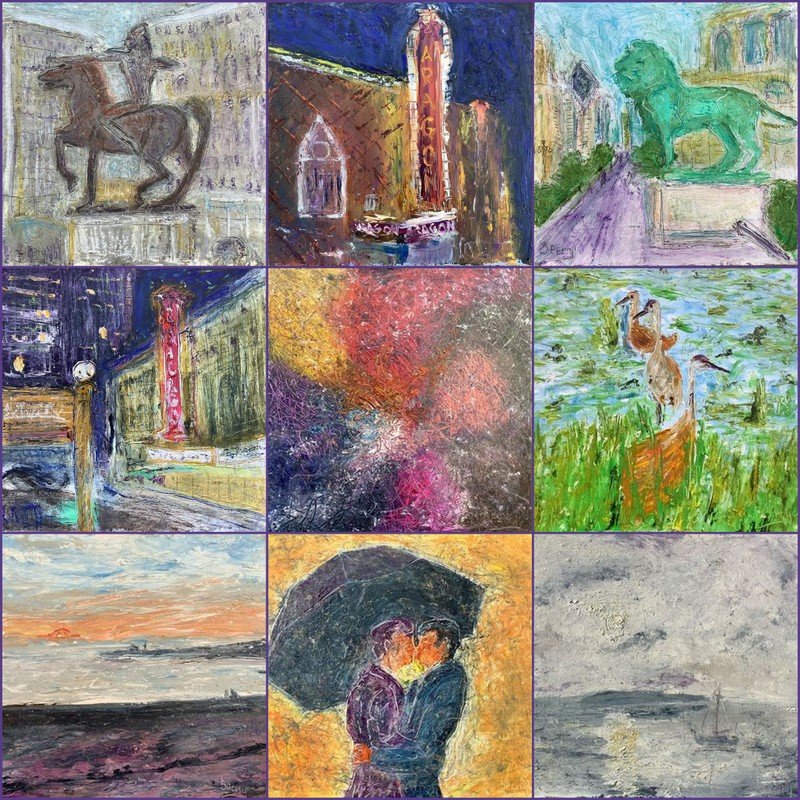
I started doing more architectural pieces over the past decade as I had decided to paint my life as it unfolds. Meaning simply, whatever is happening in my life, happens on canvas, the ultimate diary of my life. So rather than seeking things to paint, I seek a life well lived and paint it. With that the many museums, marquees of the many concert & theater venues have become part of my subject matter.
We had went to the Goergia O’Keefe, My New Yorks exhibit at the Art Institute of Chicago the end of July 2024. I’m always inspired and influenced seeing others artworks. When I think of O’Keefe, I think flowers, however these were geometric abstracts based on her time and views while living in NY in the 1920s. Her vantage point was either looking up at these immense strutures & towers or looking down and across at them from her apartment. Her line were crisp as many abstract artists are. I’m always playing in the lost and found edges areana, more as a life statement on connectness.
Several weeks later we had booked a architecturial tour down the Chicago River and out onto Lake Michigan with the pups toward the beginning of August 2024. Besides my cell and its camera I usually travel with my ipad and 35mm cameras to capture lots of photo references. While I plein air paint when I can, I usually paint more in the home studio, which atthis point is my entire home, lol. While its true plen air painting is all the rage these days, I’m more concerned with observation, memory, emotion and conveying these things in a matter-of-fact way, as well as with a certain kinetic directness.
I took near 100 photos of the city and had lots of ideas from which to paint. Many were expected compositions, however one stood out above the others. It reminded me of a piece from the O’Keefe exhibit entitled, CITY NIGHTS 1926. While hers was symetrical, my photo was more asymetrical as I like. While it wasn’t my favorite piece from the exhibit, there was something attractive in its simplicitiy, it’s line & blocks of color, that I admired, not at all how I paint. Like I said earlier though, I’m inspired by and influenced by a great many artists, both living & dead. I tend to utilize parts and then translated them ala Sperry. With this in mind This photo of the new Millenium building, The Mather, plus the London Gurantee building, provided the subject on a decent sized, 24”x36” canvas, I intended to use for scale.
Of late I’ve been more mixed media for my representaional works too, where oils had ben the standard. I use mixed media on my more abstract & comtemporary artworks, until several years ago while at the MONET exhibit at the AIC I learned and observed the many months of layerying he’s built up on his paintings. I loved the sophisticated use of color and especially how our eye averged the colos and texture from a distance. I thought about how most plen air artists, including myself tend to paint a piece alla prima, in one sitting of 1-4 hours. Then they may tweak a detail here or there in the studio, how different the results, I thought.
As stated I like to work quickly, to convey energy & movement in my art, and since my abstract & comtemporary works are mixed media have been experimenting around with it in my more representational works too. I love the fusion of media and had decided to apply the same process to this Chicago piece as well. The synergy was incredable.
I layed down an acrylic base coat of Indian Yellow, then layed down a coat of titanian white with a pinch of blue added. afterward I began blocking in shapes of the buildings in oil, utlizing both palette knife and scratching tools. I like to keep it loose as I’m not trying to illustrate an architecture, but paint the buildings according to my emotion of the day. I work quickly and added some detail, the refelction of the Mather Building tower as reflected in the new Millie builing as juxtaposed by the reflection of the Lonondon Guarantee Buildiong was key for me. I let it dry over night and in the second sitting added some ebony pencil for line, did more sgraffitto for movement and depth. Allowed it to dry throughout the day and went beck in with oil pastel and a final enhancement of oil in the pure color form.
Hope you enjoyed this journey and as always your questions & comments are welcome.
Richard
Photo translation into mixed media painting
photo capture from a boat on the Chicago River


